In our class discussion, we delved into Robin Kinross’s work, “Modern Typography: An Essay in Critical History.” This text provides a comprehensive view of typography’s evolution throughout the 20th century, tracing its journey from the modernist movement to the post-modern era, all while considering the significant impact of technology on this field. Our discussion allowed us to gain valuable insights into how the aesthetics, ideologies, and practices of typography shifted during this pivotal period in the history of design.
Following this discussion, we explored the notion of whether typography is systematic, and specifically, we examined suitable fonts for various applications, with a focus on government purposes. As a practical exercise, our group collectively decided to investigate one font – in this case, Dela Gothic – and create a type specimen for it.
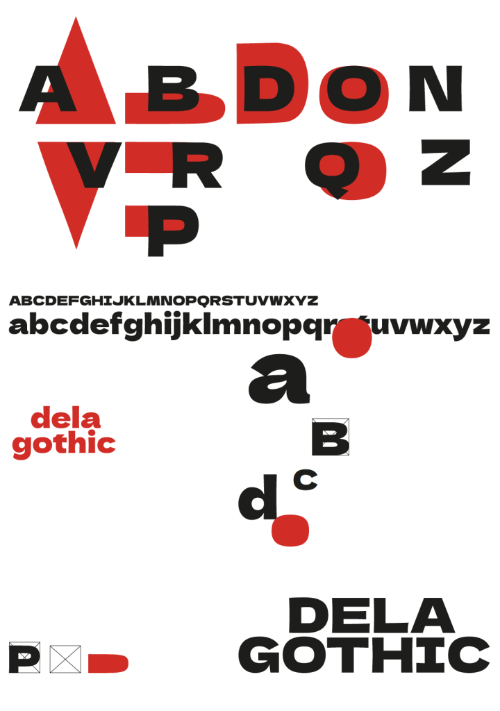
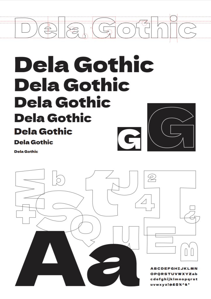
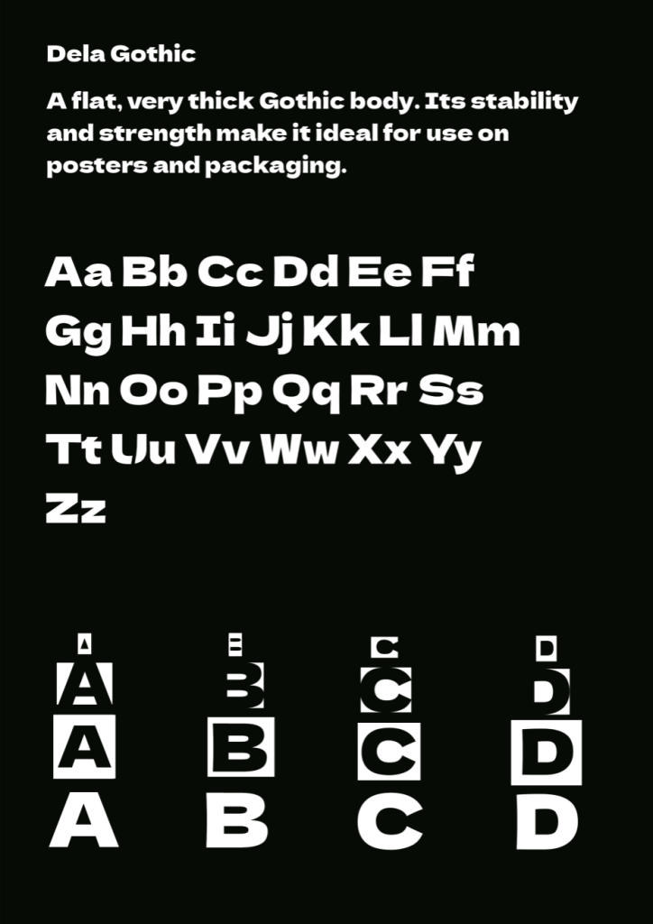
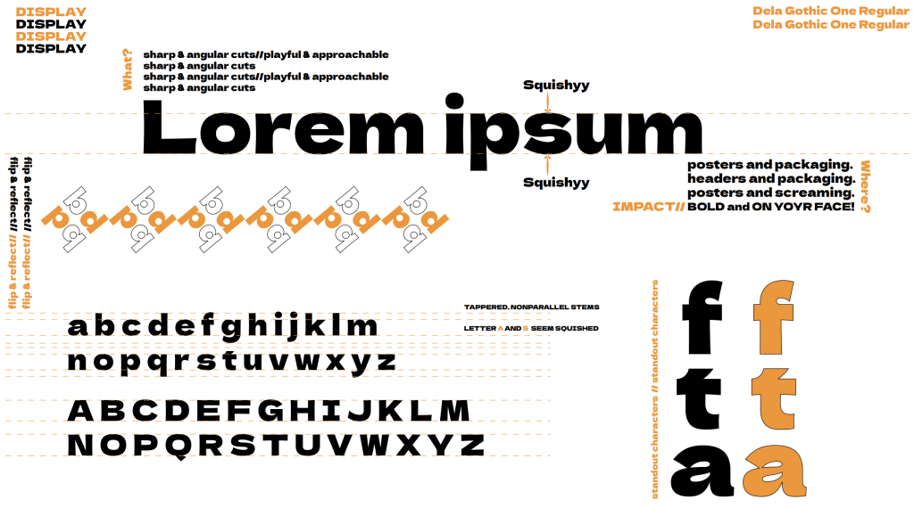
During this exercise, I made intriguing observations about Dela Gothic. Despite its seemingly simple appearance, I noticed that the font primarily consisted of horizontally straight lines, while most of its vertical lines displayed a concave shape, lending the font its distinctive and playful character. Analyzing the intricate cutouts of each letter revealed that they were uniquely shaped, often distorting corners and overall forms.
Participating in this exercise also allowed me to appreciate the diverse approaches of my fellow classmates as they crafted their own type specimens. Overall, this practical exercise proved invaluable in expanding my understanding of typography and enhancing my studio practice, enabling me to delve deeper into the captivating world of fonts and design.
My type specimen of “Dela Graphic”…
and what the others created: ..
Bibliography
Baines, P., & Haslam, A. (2005). Modern Typography: An Essay in Critical History. Hyphen Press.